The Best Types of Landing Pages to Supercharge Your Online Business

Every successful landing page campaign starts with choosing the right type of landing page. But do you know all the options? If not, you may be missing out on high-value prospects and undermining your business growth.
In this article, we will explain the different types of landing pages, their best uses, and how they can help you achieve your marketing goals.
Landing Page Options For Common Goals
A landing page is a web page that focuses on a specific marketing goal such as selling products, capturing leads or building brand identity. The table below lists key types of landing pages that are used to achieve common digital marketing goals. Each different type of landing pages is then explained below.
| Goal | Best types of landing pages |
|---|---|
| Make sales | Product landing page Explainer / Infomercial / Long-form landing pages Video landing pages Click-through landing pages Price list / Catalog pages Special offers pages Microsites Dynamic landing pages Splash pages |
| Capture leads | Squeeze pages Lead capture pages Email list opt-in pages Pre-launch pages Survey pages Unsubscribe pages Referral & friend landing pages Contest landing pages Video landing pages |
| Build brand awareness | Viral landing pages Video landing pages<Microsites |
| Help with navigation | Start here landing pages 404 error pages |
The Best Types of Landing Pages For Making Sales
The best types of landing pages for enticing customers to buy a product or service are explained below.
Product Landing Pages
A product landing page champions a particular product (or service) or a closely related group of products (or services). Use a product landing page to increase your prospects’ readiness to buy then top it off with prominent calls to action (CTAs) asking the customer to make the purchase.
To make your product landing page as effective as possible, include:
- A heading and optional subheading that convey what your product is and why the prospect should buy it. Subheadings are also often used to reduce barriers to purchase. For example, “Free Trial. No credit card required.”
- Authentic images or videos of customers having positive experiences with your product, as well as product photographs taken by a professional photographer, if possible.
- Details of product features and benefits.
- Social proof including star ratings, reputable reviews and testimonials.
- Clear and compelling CTAs, repeated at convenient points on the page.
Epson score a three-pointer with this product landing page for their EcoTank printer range, which drives home the key benefit (low-cost ink) in a feel-good setting in which basketball legend Shaquille O’Neal towers with delight above two professional product shots. Celebrity endorsement can provide social proof that many find of your prospects will find hard to ignore.
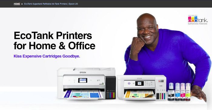
Product Landing Page Example: Epson EcoTank
Explainer Landing Pages
Explainer landing pages, also known as infomercial landing pages or long-form landing pages, are useful if you need to educate your audience about your product or service to increase their readiness to buy or to take the next step. This format is most often seen for products that are expensive, complex or novel.
Keep your explanations concise and simple if you can and use images and videos to make the educational process more engaging. Don’t forget to use a clear and relevant CTA that suits the stage of the buying process to which you have led the visitor.
Ferrari's page for their Ferrari F8 Tributo is an excellent example of an explainer landing page. The page starts by making an emotional appeal to the reader’s lifestyle impulses with the headline “Live for the Moment” while also displaying a video teaser of their product which leaves the visitor wanting to see more and prompting them to scroll down. The page then continues with impressive product imagery, highlights, detailed specifications and product education before prompting the visitor to connect with their dealer. The page makes good use of video to explain different features of this impressive car. Ferrari have not included social proof elements in the page, but Ferrari enjoys such brand reputation that they don’t need it – demonstrating that each landing page needs to be tailored for the product and audience at hand.
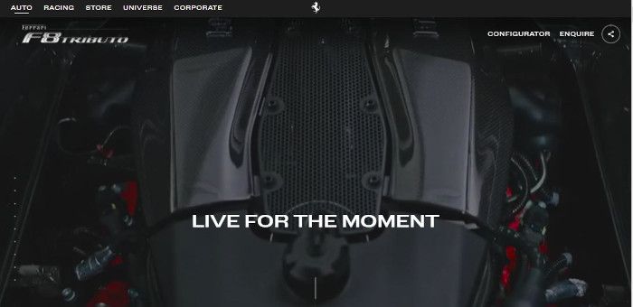
Explainer Landing Page Example: Ferrari F8 Tributo
Video Landing Pages
Video landing pages are great options to promote your brand, product or service using video content as the page focus. Your videos should be entertaining and informative without being too long. The optimal video length will depend on your industry and what you have to say, but ensure each minute is packed with value for the viewer.
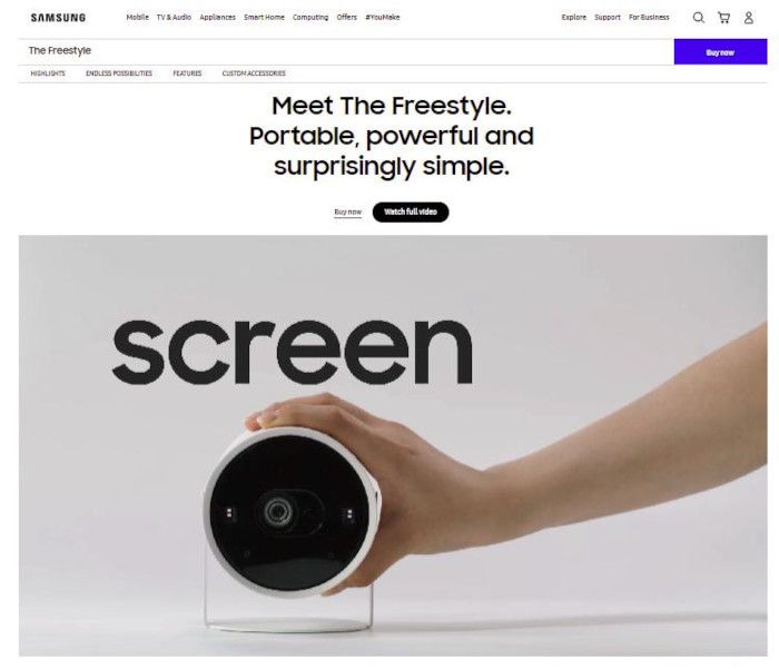
Samsung make good use of the video landing page format when promoting their portable projector, The Freestyle). The video stars the photogenic and nifty product while highlighting its features and benefits. In less than 30 seconds, the video excites and educates, inducing a compulsion to buy. Or was that just me?
Video Landing Page Example: Samsung - The Freestyle
Click-Through Landing Pages
Click-through landing pages are the types of landing pages that redirect your visitors to a different page for conversion. These pages are used to gain your customer’s attention and build trust in your business before directing the visitor to the next stage in their buying journey.
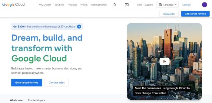
Google use a click-through landing page to encourage customers to click through to try Google Cloud Platform for free while also providing an option to click through to submit a sales inquiry.
Click-Through Landing Page Example: Google Cloud Platform
Price List Landing Pages
A price list landing page helps your prospects find relevant prices easily. It is best used if the basic nature of your product or service is already well understood by many in your target market, giving buyers the confidence to make a beeline for the price as the first step in their vetting process.
On your price list landing page:
- Make sure your heading makes it clear what you are offering and give the visitor a clear reason to choose you.
- Highlight key benefits of your offering.
- Consider adding a price comparison table to help your prospects find the most suitable solution for their needs.
- Build in social proof to reassure your prospects.
- Anticipate common questions and objections and answer them on your page. FAQ sections can be helpful in this regard.
- Include CTAs that cater for customers who are ready to buy as well as those for whom your pricing is merely the beginning of their exploration of your offer.
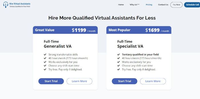
This price list landing page from Hire Virtual Assistants uses a simple layout that quickly describes two services, their prices and key benefits. Two CTAs are offered: one for those ready to buy and another for those who are ready to explore after vetting the price.
Price List Landing Page Example: Hire Virtual Assistants
Special Offers Landing Pages
Special offers landing pages list all your current discounts and deals in one place. These landing pages are suitable if you have:
- Frequent specials, and
- Price-sensitive prospects.
Keep your special offers landing page up-to-date to encourage interested prospects to return. Special offers landing pages provide an opportunity to capture email list subscribers – offer to send your prospects details of future specials and allocate resources to cultivate your relationship with those subscribers.
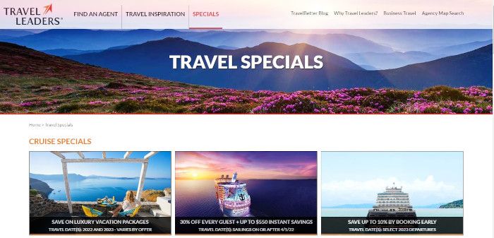
The travel industry often makes use of special offers landing pages. This one by Travel Leaders gets straight to the point by stating the purpose of the page then using seducing visitors with glorious imagery for each special deal.
Special Offers Landing Page Example: Travel Leaders
Microsites
Microsites are small self-contained websites with a narrow focus. Microsites often supplement a larger website and may be located on a subdomain of the main site, like microsite.mainsite.com, or may have their own domain, like microsite.com.
Microsites are a user-friendly sandbox in which the prospect is limited to viewing the information most relevant to them. Such containment is particularly helpful if your main site contains a lot of information that is not relevant to the visitor.
Neil Patel uses a microsite to provide a 7-Week Action Plan to help the visitor improve their search engine optimization (SEO). The sandboxed learning environment helps the visitor focus and avoid distracting links and less relevant content. The navigation menu of the main site has been omitted from this microsite, with all microsite content being accessible through an accordion organized by week.
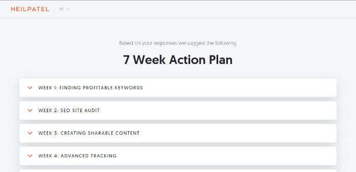
Microsite Landing Page Example: Neil Patel
Dynamic (Personalized) Landing Pages
Dynamic landing pages show different content to different groups of people. The landing page is dynamically generated to match what the visitor is looking for as closely as possible, taking inputs like visitor location and search engine keywords used by the visitor.
A typical use of dynamic landing pages is to insert each visitor’s location into the page heading to make the page seem more relevant to them. The country can be detected via the visitor’s IP address, and more granular information such as their city or suburb may be available within their search terms if they are looking for local services. Geolocation details, if made available by the visitor, provide potential for even greater customization.
The keywords used by the visitor when the search engine directed them to your website can also be used to customize content. For example, if a visitor arrives on the dynamic landing page after searching for “pink hat for child” on a search engine, the dynamic landing page could be built on the fly, with the most relevant pink hat products placed prominently rather than randomly on the page.
Dynamic landing pages increase conversions because the tailored content engages visitors more successfully than the generic alternatives. If you are running pay-per-click (PPC) campaigns, consider using dynamic landing pages to greet visitors with the information they are looking for immediately after they click through.
To build dynamic landing pages on the fly, you will need to find or hire a web developer to make your dynamic landing pages interactive and intelligent enough to meet your goals. If that sounds too complicated or you don’t have the budget for that, then an alternative is to make a set of static landing pages instead, with each static page tailored to a particular market segment.
Splash Pages
Splash pages are introductory pages or screens (modal windows) that present byte-sized information as the visitor enters the page. Splash pages can be useful to highlight offers, display conditions of entry, collect information, and more. The copy on these pages should be short and simple. If you are using modal windows, make sure the visitor can close it easily and that it is mobile friendly.
KillerStartups greets the visitor with an opportunity to join Startups Unlimited, infusing a little FOMO pressure with their “Limited Time Only” offer.
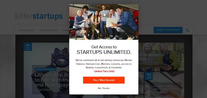
Splash Page Example: KillerStartups
The Best Types of Landing Pages For Capturing Leads
To capture leads use: squeeze pages, lead generating pages, mailing list opt-in pages, pre-launch landing pages, survey or quiz landing pages, referral and friends landing pages and contest landing pages. Read below for tips on each.
Squeeze Pages
The aim of a squeeze page is to convince your visitor to hand over rudimentary personal information such as their name and email address. Visitors will need a good reason to give you those details, so you will need to offer a valuable inducement to do so, such as:
- Access to special offers or benefits
- Downloadable items such as an eBook or app
- A subscription to a mailing list they perceive as worthwhile
- Access to valuable content such as a course or webinar
Usually a squeeze page consists of:
- A short but compelling sales script in which the benefit the visitor will receive in exchange for submitting their details is made crystal clear.
- A short form to collect the visitor’s details. Keep the number of form fields to the bare minimum and don’t ask for sensitive information like age or date of birth.
- A call-to-action button that concisely reiterates the benefit available upon clicking it.
This squeeze page by Web FX spells out exactly what benefits the visitor can expect to receive by submitting the form. The form contains three fields but only one is exposed to the visitor at a time, making the form approachable. Be mindful though that the patience of your visitors will diminish with each additional field.
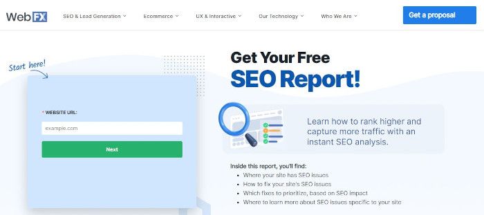
Lead Generating Landing Pages
Lead generating landing pages are like squeeze pages in that they aim to collect basic information about your prospects. However, lead generating landing pages focus more precisely on visitors who have some interest in your product or service but are not yet ready to buy. Rather than letting such prospects disappear into the cyberspace night, lead generating landing pages seek to capture their details so that the prospect’s interest can be nurtured, hopefully culminating in a later sale.
In a shameless moment of self-promotion, we will use our own landing page example here. Our Hire React Developers page contains long-form content that explains both the React framework itself as well as how to hire a React developer. A sticky form accompanies the reader down the page and aims simply to begin a conversation with interested prospects.
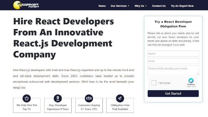
Lead Generating Landing Page Example: Support Resort
Mailing List Opt-in Pages
Email list opt-in pages attract prospects to subscribe to your mailing list. To convince people to join your mailing list you will need to:
- Define the scope of what you intend to send them. What information will you send? How often will you send it?
- Convince them that your content is of value to them.
- Reassure them that you will not send them unwanted messages outside the scope you defined.
- Promise not to share their details with anyone else or ask for their explicit consent to do so, with an option to opt out.
- Preferably explain your unsubscribe process, which should always respect the right of the subscriber to unsubscribe easily and without fuss.
- For extra impact, add social proof such as the number of subscribers you already have.
This signup page from TLDR Media, LLC expresses in just six words the content and benefit on offer to subscribers: “Byte sized news for busy techies”. The email frequency is mentioned twice with reassuring social proof directly beneath the email address field. They have kept the CTA simple (“Subscribe”). All perfect for an audience that is looking for clear and concise information.
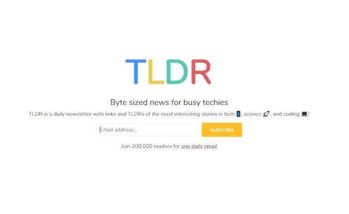
Mailing List Opt-In Landing Page Example: TLDR
Pre-Launch Landing Pages
Pre-launch landing pages are temporary pages that promote the upcoming release of a product, service or website. Pre-launch landing pages can build excitement, create communities and give interested prospects the opportunity to connect with you early, perhaps even placing a pre-order.
This pre-launch landing page on mothsintheact.org appeals to moth enthusiasts with much moth imagery then announces the upcoming book launch. The page collects the email address from interested visitors who want to be notified upon launch.
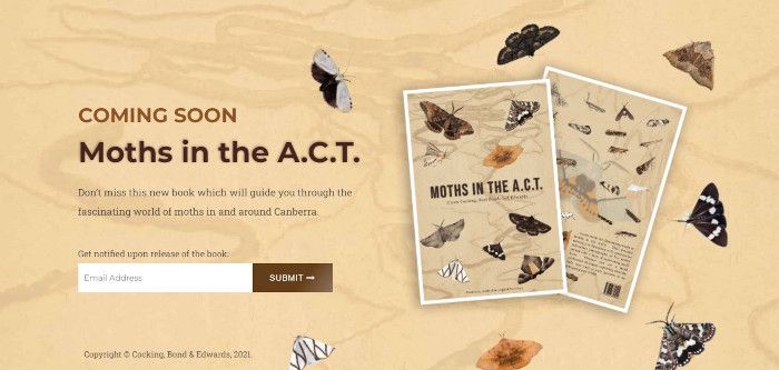
Coming Soon / Pre-Launch Landing Page Example: Moths in the A.C.T.
Survey or Quiz Landing Pages
A survey or a quiz landing page is a great way to improve your on-page engagement. To attract participants, you will need to make your survey or quiz worth their while by providing entertainment, interesting information or other valuable opportunities. Disclose the correct answers if there are any so that your participants do not feel you have have left them empty handed. Add a CTA at the end of the quiz or survey to prompt the participant deepen their engagement with you.
Neil Patel makes great use of this survey technique by capturing attention of the intended audience with a simple appeal: “Want More SEO Traffic?” Name an online business that would not welcome that thought. You can’t, right? Neil then offers the prospect a simple exchange: answer 9 quick questions and get a 7-week action plan to get more traffic. Then just one field to fill out to get started. Best practice from one of the masters.
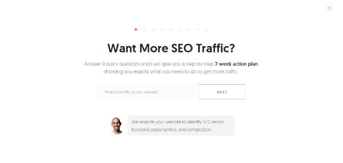
Survey or Quiz Landing Page Example: Neil Patel
Referral & Friends Landing Pages
A referral landing page encourages your customers and visitors to refer a friend to your business.
Referral landing pages are worthy of your consideration. Referred leads convert 30% better than leads from other marketing channels and the lifetime value of referred customers is 16% higher on average as well.
Incentivize the referrer by offering a sweetener for both themselves and their friend, then everybody wins. Help the referrer feel proud of their referral by providing a welcoming landing page for their friend as well and give that web address to the referrer so that they know exactly where to send their friend.
Front of the Pack present a simple and appealing offer to refer a friend. The page also explains the objectives of their referral program and includes a FAQ section. When the simple form is submitted, a link is provided for the friend landing page, making it easy for the referrer to spread the word.
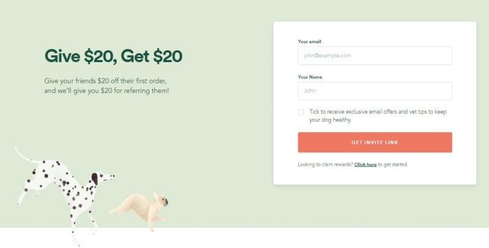
Referral Landing Page Example: Front of the Pack
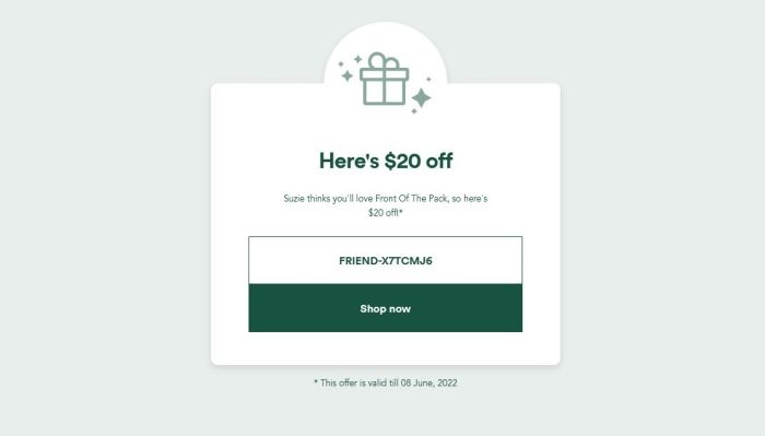
Friends Landing Page Example: Front of the Pack
Contest Landing Pages
Contest landing pages have potential to capture leads who may not have otherwise noticed your brand. To be effective, design your contest to attract your target market.
Typically contest landing pages highlight the prize along with an entry form. Make sure that your conditions of entry are clear and accessible, and that you are compliant with any applicable laws regulating contests in your relevant jurisdiction(s).
Be clear too about what you will do with the information you collect and give the entrants an opportunity to opt out of receiving messages that are not about the contest – they may report your messages as spam if you don’t, leading to your mail server being blacklisted by anti-spam engines.
Healthy Rich uses a contest landing page to invite writers to submit essays for possible publication and prize money. Healthy Rich also makes clever use of a mailing list so writers can subscribe to receive updates about current and future contests. Their contest page respects potential entrants by clearly explaining the contest itself as well as what the winners can expect, and provides a short and simple entry form as well.
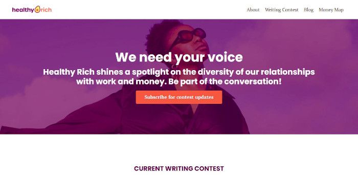
Contest Landing Page Example: Healthy Rich
The Best Types of Landing Pages For Building Brand Awareness
Viral Landing Pages
In the age of social networking, we all are familiar with the word “viral”. Viral landing pages are those that generate sufficient novel interest that your customers and others feel compelled to show the page to others. To go viral, your page will need to have an unexpected element such as a surprisingly generous discount, or content that is unusually funny, intriguing or shocking. Creating such buzz is not easy but if you already have a substantial social media following then you will have a better chance at success. Give your viral landing page a heavy kick-off in social media if you can. A few more nudges with shares and retweets may lead to it snowballing.
Perhaps the best recent example of a viral landing page was the Wordle game. Initially released on powerlanguage.co.uk website and swiftly bought by the New York Times, the game delighted a wide international audience with its simple daily problem to solve. The true brilliance of Wordle though was in the way it incentivized players to spread the word on social media by providing a simple but attractive graphic for players to post on social media to communicate their performance in the daily game.

Viral Landing Page Example: Wordle | New York Times
Tastefully incentivize your viral page visitors to spread the word about your landing page and you may go viral too.
Unsubscribe Landing Pages
Avoid burning bridges with your departing subscribers by impressing them with a gracious goodbye.
If you are sending emails to a list of subscribers then you will need to provide an unsubscribe facility of some sort in order to comply with legal requirements. By using an unsubscribe landing page for this purpose, you can help the departing subscriber end their subscription on a positive note.
Make the unsubscribe process simple and avoid inconveniencing the outgoing subscriber. You can ask the subscriber why they are leaving but make answering optional. Maintain a respectful and apologetic tone.
This unsubscribe landing page from AAPG demonstrates best practice by providing the departing subscriber with an opportunity to provide feedback while facilitating a hassle-free removal process.
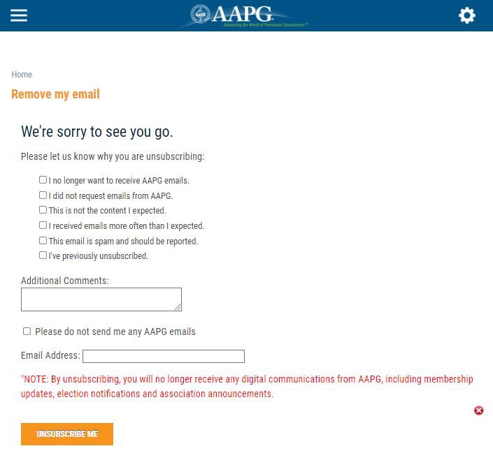
Unsubscribe Landing Page Example: AAPG
The Best Types of Landing Pages For Navigation
Start Here Pages
Start Here pages can be useful to break down your content into digestible chunks and to provide navigation assistance to your visitors. Such pages can be a breath of fresh air if your prospects are not sure where to start. Consider adding a Start Here page to your website if:
- your content may be overwhelming to your audience
- you have a somewhat complex topic or process to explain
- your content or process involves a series of steps or completion of a checklist
- your site contains different sections and your visitors may need help to find the one(s) relevant to them.
55+ Real Estate Services makes good use of a Start Here landing page to direct visitors to the section of the site most relevant to them and to explain the services they have on offer.
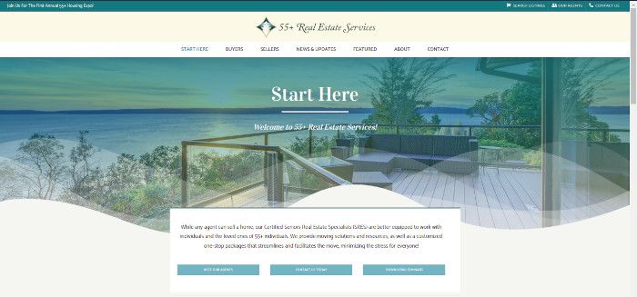
Start Here Landing Page Example: 55+ Real Estate Services
404 Error Pages
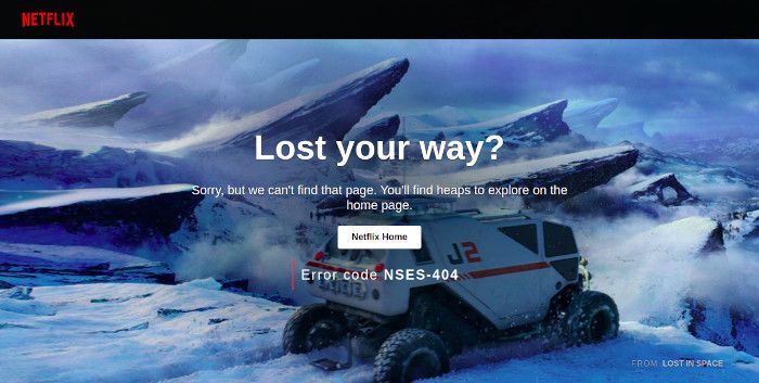
Even 404 Error pages are opportunities to enhance your brand image and help your visitors. Keep the content brief but ensure that the design and tone of the page remain consistent with your brand identity. Use subtle elements such as pictures of your products to generate interest, and be sure to help the visitor with either a link back to your home page or a menu within the page.
Netflix show us how it is done. Rather than presenting a boring procedural page, Netflix use an image from the movie “Lost in Space” to empathize with your plight, as they gently inquire: “Lost your way?” They reassure that you will provide better content on their home page and provide a button to take you there. An error code is sensibly added to identify the nature of the problem, presumably for internal use in case of a customer inquiry about the error.
404 Error Page Example: Netflix.com
Conclusion
Explore different types of landing pages to achieve your marketing goals. Some page types may work unexpectedly well for your audience, so be sure to test the different options to find the solutions that work best for you.
