Chakra UI Components Library: Sophisticated Simplicity

Learn why Chakra UI has already become one of the most popular UI component libraries for React development.
Chakra UI is an open source React component library that burst onto the scene in November 2020 and has already accumulated over 30,000 Github stars with npm downloads approaching 400,000 per week as of December 2022.
Chakra UI is a developer-friendly library that facilitates rapid UI development with minimal code, while making it easy to produce professional custom-themed UIs that comply with WAI-ARIA accessibility standards. It also has built-in support for light and dark mode choices.
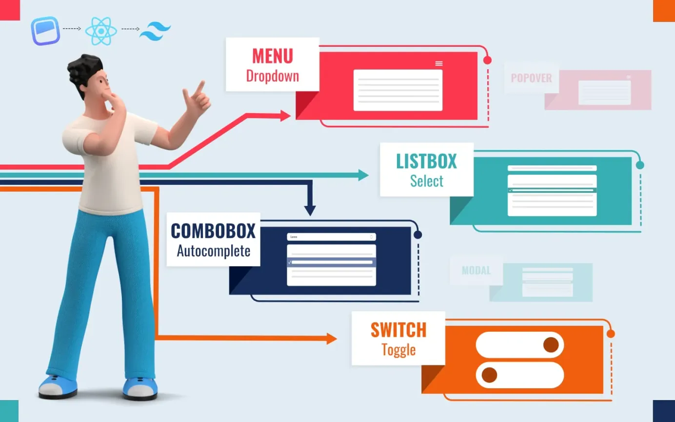
Chakra UI components
Chakra UI's large library of pre-built, fully-themed components includes:
- Data displays: badges, cards, code, dividers, keyboard keys, lists, statistics, tables and tags.
- Forms: buttons, checkboxes, icon buttons, input fields, form controls, PIN inputs, number inputs, radio buttons, simple sliders, range sliders, select boxes, switches and text areas.
- Graphics: avatars, icons and images.
- Navigation: breadcrumbs, links, link overlays and skip navs.
- User feedback: alerts, progress indicators, spinners, toasts and skeletons.
- Overlays: alert dialogs, drawers, menus, modals, popovers and tooltips.
- Selective content reveals: accordions, tabs, visually hidden info.
- Typography: headings, highlights and text formatting.
- Other: close buttons, portals, transitions.
Advantages of using Chakra UI
Chakra UI has many features that should help drive efficient development and, in doing so, minimize your UI development costs. These features include support for style props, easy implementation of responsive designs, theming and accessibility. Chakra UI is also well documented with an active development community and a fast-growing ecosystem.
Style Props
With Chakra UI, you can alter the style of a component simply by passing props to it. For example, the size and textTransform props define how to display the heading in the code below:
  <Box>
     <Heading size='sm' textTransform='uppercase'>
       Hire PHP Developers
     </Heading>
     <Text pt='2' fontSize='xs'>
       Support Resort provides full-time developers
	   from US$899/month.
     </Text>
  </Box>
Easy implementation of responsive designs
There is no need for @media queries or nested styles, you can simply define screen-size breakpoints and then use those breakpoints to alter the display as needed. For example, let's say you define the following breakpoints:
// define breakpoints (these are in fact the defaults)
const breakpoints = {
  sm: '30em',
  md: '48em',
  lg: '62em',
  xl: '80em',
}
You can use the breakpoints to easily define using either an object or an array approach.
The object approach is similar to using Tailwind, for example, to adjust the title font depending on the screen size you might use something like this:
<Text fontSize={{ base: '20px', md: '36px', lg: '50px' }}>
  Hello world
</Text>
The array approach would implement the above by arranging the font sizes from the smallest breakpoint to the largest:
<Text fontSize={['20px','36px','50px']}>
  Hello world
</Text>
Theming
Chakra UI comes with a default theme which you can customize to your requirements. You can tailor the theme tokens, change component styles, modify global styles and extend the theme.
Accessibility
All of Chakra UI's components are WAI-ARIA compliant to ensure your app will be accessible to everyone.
Well documented and actively maintained
The Chakra UI library is well-documented, with clear and concise examples of how to use the components, so developers can get up and running quickly. The library is also actively maintained, with nearly 30 updates to version 2 as of December 2022.
Active community
Created by UI engineer Segun Adebayo, Chakra UI has an active core team plus a large cohort of project contributors. Some third-party products are available such as website and admin dashboard templates built for Chakra UI. No doubt more products will emerge for this young but outstanding UI library as 2023 progresses.
Works with major React frameworks
You can use Chakra UI with your favorite React development frameworks including:
- Next.js
- Remix
- Create React App
- Vite
- Gatsby
- Blitz.js
- RedwoodJS
- Meteor
How to install Chakra UI
Before installing Chakra UI, first verify you have both Node.js and npm installed on your system with the following shell commands, which should return the version number of each:
node -v
npm -v
To install Chakra UI into your project via npm, type the following shell command:
npm install @chakra-ui/reactAlternatively, you can install Chakra UI using yarn:
yarn add @chakra-ui/react
Integrate Chakra UI into your app
Once you have installed @chakra-ui/react, wrap your app with the ChakraProvider at the root of your application, such as in your index.jsx file:
import * as React from 'react'

// 1. import `ChakraProvider` component
import { ChakraProvider } from '@chakra-ui/react'

function App() {
  // 2. Wrap ChakraProvider at the root of your app
  return (
    <ChakraProvider>
      <TheRestOfYourApplication />
    </ChakraProvider>
  )
}
Once the ChakraProvider has been imported to wrap your app, you can import the Chakra UI components and styles into your React components like this:
import { Button, Input } from '@chakra-ui/react'
The Framework Guide on the Chakra UI Getting Started page provides further detail on how to get started with Chakra UI in major frameworks.
Chakra UI Component Examples
Basic example
The Chakra UI example below demonstrates how to set up a simple app.
Another example: A simple to do list
In this example, Aziz Abdullaev creates a simple "To Do" list using Chakra UI:
Further information
The following links will help get you started with Chakra UI:
- Chakra UI Docs - clear and comprehensive information on Chakra UI
- Chakra UI for Beginners - a free 60-minute course for absolute beginners.
- Build a Modern User Interface with Chakra UI - a free 42-minute video course which will lead you through using Chakra UI.


