Headless UI React Component Library - Built for Tailwind CSS
Headless UI React components are built to work with the tremendously popular Tailwind CSS, and can drive rapid UI development while continuing to enjoy the benefits of Tailwind.
What is Headless UI?
Headless UI is an unstyled React component library from Tailwind Labs that was built to work with their phenomenally successful styling solution, Tailwind CSS. Although both products can be used independently, developers can combine both to rapidly create professional user interfaces using pre-built components styled with Tailwind CSS.
By putting the styling in the hands of the developer rather than being built-in to the UI components, the developer enjoys easy control over all aspects of styling.
Since being launched in late 2020, Headless UI has accumulated over 18,000 Github stars. As of December 2022, Headless UI was averaging nearly 800,000 downloads per week. This success reflects the popularity of Tailwind CSS itself, which averaged approximately 4.5 million downloads per week during the same period.
What is Tailwind CSS?
Unlike traditional CSS frameworks, which usually provide a discrete set of CSS components, Tailwind CSS provides a set of low-level utility classes that can be used to style any element in a flexible and modular way. For example, the code below uses the Tailwind CSS classes text-sm, text-blue-500 and font-semibold to display "Hello World" in small mid-blue semibold text.
<p class="text-sm text-blue-500 font-semibold">
Hello World
</p>
The beauty of Tailwind CSS is that it offers a set of consistent CSS classes which can be used across web pages and applications, meaning styling can easily be achieved by simply inserting familiar class names into your HTML, without having to write any custom CSS classes!
Tailwind CSS makes creating a responsive design easy too, as the code structure it uses to implement responsive designs is intuitive and straightforward. Dark and light modes are also readily supported. Tailwind creates an optimized CSS file for a minimal CSS footprint as well.
Though you can customize styling as much as you want with Tailwind CSS, too much customization could negate the key benefit of utilizing Tailwind in your project in the first place.
What components are included in Headless UI?
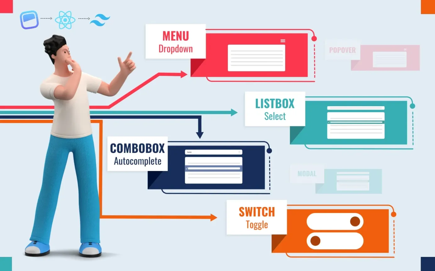
Headless UI components are flexible and customizable, with the powerful simplicity that Tailwind Labs are known for. However, as of January 2023, the Headless UI React component library includes fewer UI components than many competing libraries. Currently the following components are included:
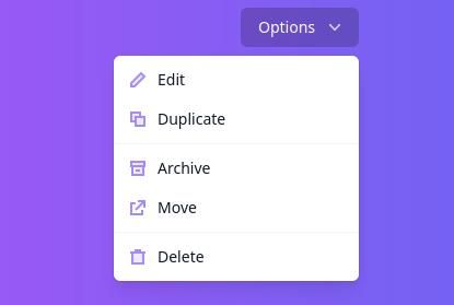
- Navigation: drop-down menus
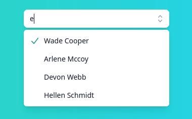
- Forms: Select boxes, combo boxes (autocomplete), switches, radio groups
- Selective content reveals: accordions, tabs, visually hidden info.
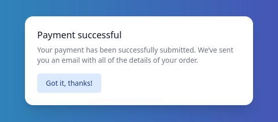
- Overlays: modals, popovers
- Other: transitions
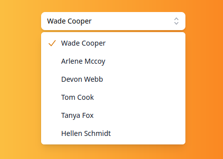
Note that the above does not include components for a range of common components such as cards, code views, icon buttons, avatars, sliders, progress indicators, breadcrumbs, buttons, spinners, toasts, and so on. However, the components included in Headless UI cover many of the common use cases and will inject a good dose of class into your apps due to their slick appearance and function. Some examples are shown in the image gallery below.

How to install Headless UI for React?
To install the Headless UI, all you have to do is use npm - the package manager included with Node.js. To get started, ensure both Node.js and npm are installed on your system by running these shell commands which will let you know the version number of each:
node -v
npm -v
Once you have confirmed that npm and Node.js are installed, change to the folder containing the project for which you are planning to use Headless UI, then run the following shell command to install it:
npm install @headless-ui/react
Alternatively, you can use the yarn package manager to quickly install it with the following shell command:
yarn add @headless-ui/react
Once the @headless-ui/react library is installed, you can import its components into your React apps.
Headless UI examples
Basic example of using Headless UI for React
Here is an example of how you might use the Headless UI library for React to create a switch:
import './App.css';
import { useState } from 'react'
import { Switch } from '@headlessui/react'

function App() {
  const [enabled, setEnabled] = useState(false)

  return (
    <Switch
      checked={enabled}
      onChange={setEnabled}
      className={`${
        enabled ? 'bg-indigo-600' : 'bg-gray-300'
      } relative inline-flex h-8 w-12 items-center rounded-full`}
    >
      <span className="sr-only">Yes, please do it!</span>
      <span
        className={`${
          enabled ? 'translate-x-6' : 'translate-x-1'
        } inline-block h-4 w-4 transform rounded-full bg-white transition`}
      />
    </Switch>
  )
}


export default App;
Another example: Popover effect
This example from CodePen user @simondl produces a simple popover effect using Headless UI.
Further Information
For further details, please refer to the official docs at: https://headlessui.com/.
Other unstyled React UI component libraries
Another popular unstyled React UI component library is Radix UI. To learn more about Radix UI, please refer to our articles:
 Staff Writer
 Staff Writer


