Radix UI: An Unstyled UI Component Library for React

Looking for a React UI component library that gives you full control of styling? Radix UI is one of the few to offer that benefit, while making it easy for you to add accessible UI components to your apps.
Radix Primitives, also known as "Radix UI" is a user interface (UI) component library that, unlike most others, leaves all the styling choices in your hands.
Like other leading UI component libraries for React, Radix UI enables you to build your apps faster and to provide a consistent and high-quality user experience throughout your apps.
Radix UI is an open source library offered under the MIT license. It was released in December 2020 and has already accumulated nearly 7,000 Github stars, with approximately 250,000 weekly npm downloads for its most popular components as of January 2023.
Radix UI is maintained by WorkOS, a software company based in San Francisco.
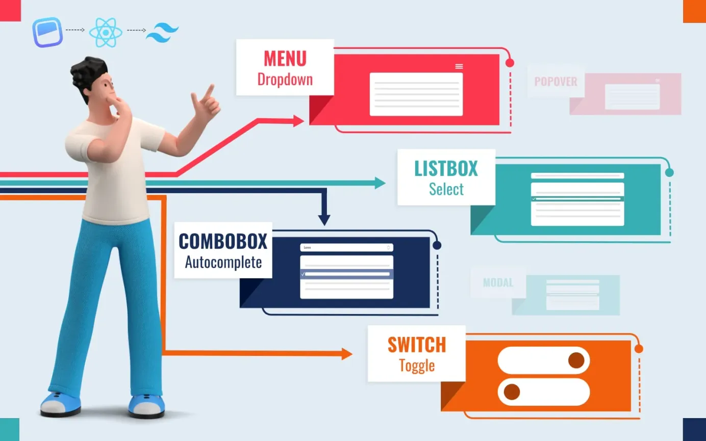
Radix Primitives: What's Included?
The Radix Primitives UI component library includes a solid set of unstyled components:
- Data/info displays: separators (horizontal and vertical dividers).
- Forms: toggle buttons, toggle button groups, checkboxes, radio buttons, simple sliders, select boxes, switches.
- Graphics: aspect ratio, avatars, icons.
- Navigation: context menus on right-click or long press, dropdown menus, navigation menus.
- User feedback: progress indicators, toasts.
- Overlays: alert dialogs, dialogs, hover cards, popovers, tooltips.
- Selective content reveals: accordions, scroll areas, tabs, collapsible panels, visually hidden info.
- Other: toolbar containers, portals, labels.
Carousels and menubars are apparently coming soon but, as of January 2023, Radix UI does not include: badges, cards, code displays, lists, statistics displays, tables, tags, icon buttons, input fields, number inputs, range sliders, text areas, breadcrumbs, spinners, drawers and modals.
Why choose Radix UI?
Keep full control of styling
With Radix UI, you can style the components with any styling method you like, such as:
- Vanilla CSS
- Tailwind CSS
- CSS Pre-processors like Sass and Scss
- CSS-in-JS
You can pass a className prop to any component or component part to specify its CSS class. There is also a data-state attribute for every stateful component, so you can define different styles for different states.
You can therefore exercise complete control and ensure your UI is fully concordant with your brand aesthetics.
Stop building components that are not accessible
It can be hard to build components from scratch that adhere to the WAI-ARIA accessibility standards, and due to that there are many components in use today that are not accessible to all. Radix UI provides a compliant set of components out-of-the-box, making it easy for you to build apps that everyone can use.
Easy customization of components
Radix UI's open component architecture gives you fine control over each component's parts. You can wrap components and add your own props, event listeners and refs.
Server-side rendering
Server-side rendering is a method used to reduce page load times by rendering content to HTML on the server-side rather than in the browser. Radix UI fully supports server-side rendering for React version 18 and above.
Components can be uncontrolled or controlled
Components are left uncontrolled by default, meaning their states are automatically handled by the DOM rather than within the component itself. You can use controlled components though if needed. All behavior wiring is taken care of internally so that you can get started without needing to create local states.
Incremental adoption of primitives
You don't need to load the full set of components - you can simply install and use the ones you need. For example:
npm install @radix-ui/react-toast
npm install @radix-ui/react-switch
npm install @radix-ui/react-tooltip
How to Install Radix UI
Install Radix UI via npm
To get started with Radix UI, first check that you have both Node.js and npm installed on your system with the following shell commands, which should return the version number of each:
node -v
npm -v
Once both npm and Node.js are installed, change to the folder containing the project for which you are planning to use Radix UI.
Each component of Radix UI needs to be installed individually like this:
npm install @radix-ui/COMPONENT-NAME

# For example, to install the Toast component:

npm install @radix-ui/react-toast
There is also a radix-ui npm package available that includes all the Radix UI components, but it is not maintained by the Radix UI team.
Install Radix UI via yarn
You can use the yarn package manager to install the components you require:
yarn add @radix-ui/COMPONENT-NAME

# For example, to install the Toast component:

yarn add @radix-ui/react-toast
Once installed, simply import the components into your React app to use them.
Radix UI Example
In the example below, a simple dropdown menu is placed on the screen and styled. To view the different parts of the code code, click on the tabs along the top of this code viewer. To see the working dropdown menu, slide the grab bar on the right-hand side to the left.
Further Information
For further details, please refer to the official docs at: https://www.radix-ui.com/docs/.


