Rebass: React UI Components Using the Styled System

Get your UI working quickly with Rebass, a concise UI library which is straight-forward to learn and suitable for both prototyping and production.
Rebass is a React component library based on the Styled System. Rebass uses a declarative syntax which is quick to learn and easy to maintain, and can be used to develop consistent themed UIs that adhere to desired design constraints.
Although your developers will get your project moving quickly with Rebass, a designer's touch will be required to finesse each component's styling.
By default, Rebass works with Emotion, a CSS-in-JS solution, but it is also compatible with Styled Components. You can read more about Emotion here:
 Staff Writer
What components are included with Rebass?
Rebass provides a solid set of low-level components that are easy to customize and can be mixed together to develop simple or complex UIs. The components included in the Rebass library are:
- Data displays: boxes, badges, cards.
- Forms: buttons, checkboxes, labels, input fields, radio buttons, simple sliders, select boxes, switches and text areas.
- Graphics: avatars, images, image tiles.
- Navigation: nav bars, links.
- Typography: headings, text formatting.
- Other: flex layouts.
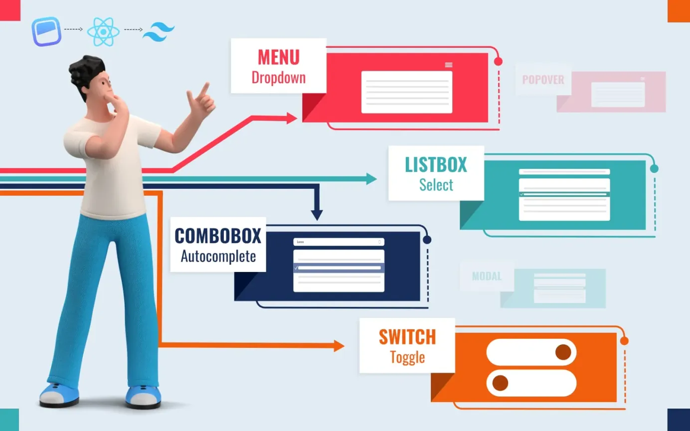
Components that are not available out-of-the-box with Rebass include icon buttons, range sliders, progress indicators, spinners, toasts, drawers, dropdown menus, modals, popovers, tooltips, tabs, accordions, statistics, tables, code previews, lists and more.
Still, Rebass provides a strong selection of core components which you can use to get your UI up-and-running quickly, making it a good choice for prototyping as well as for many production purposes.
Strengths of Rebass
Simple declarative syntax
Rebass uses a straightforward declarative syntax based on Styled System props so that developers can write CSS styles directly into React.js components. For example, a Box component can be placed and styled with code like this:
<Box
  p={5}
  fontSize={4}
  width={[ 1, 1, 1/2 ]}
  color='white'
  bg='primary'>
  Box
</Box>
Theming support
Rebass is stylistically unopinionated by default, but you can add a theme if you wish. Rebass is fully compatible with Theme UI, or the theme can be defined using Emotion's ThemeProvider.
Responsive layouts
Rebass uses an array-based syntax that enables developers to easily make adjustments for different screen sizes.
Extensible
Rebass components can be used as building blocks to build custom UI components.
Variants
A variant prop can be passed to any component so that you can define different styles for the component. For example, you could define dark and light styles for your components.
How to install Rebass
To install Rebass, check that you have both Node.js and npm installed on your system with the following shell commands, which should return the version number of each:
node -v
npm -v
Once you have confirmed that npm and Node.js are installed, change to the folder containing the project for which you are planning to use Rebass, then run the following command to install it:
npm install rebass
Rebass examples
Basic example
In this basic example, a simple box is placed to hold a heading and button:
import React from 'react'
import { Box, Heading, Button } from 'rebass'

export default props =>
  <Box>
    <Heading>Hello</Heading>
    <Button>Rebass</Button>
  </Box>
Another example
In this example from the Rebass project, two buttons are rendered, one with primary button styling and one with secondary button styling.
Further information
For further details, please refer to the official docs at: https://rebassjs.org/.


