Semantic UI React: An Introduction

The Semantic UI React library offers both common and novel components to fast-track your UI development in a technically robust way.
Semantic UI React provides a ready-to-use set of UI components which can be used to craft visually stunning user interfaces with ease.
This widely-used library is a React implementation of the popular Semantic UI framework. The original Semantic UI framework provided an easy method of building attractive user interfaces with jQuery. However, Semantic UI React is jQuery-free.
Key features of Semantic UI React
Some of the key features of Semantic UI React include:
- A versatile set of pre-built components, ranging from simple elements like buttons and checkboxes to more advanced ones like accordions and progress bars.
- Built-in theming support using the powerful theming engine from Semantic UI.
- Full compatibility with React ecosystem tools, such as Create React App and Webpack.
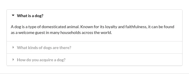
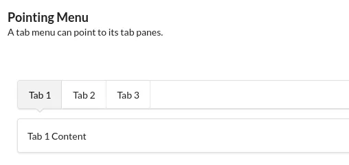
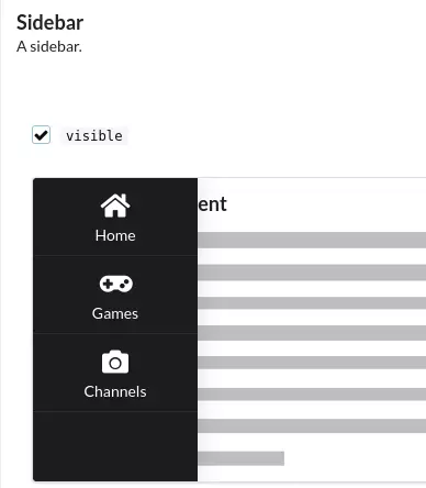
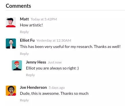
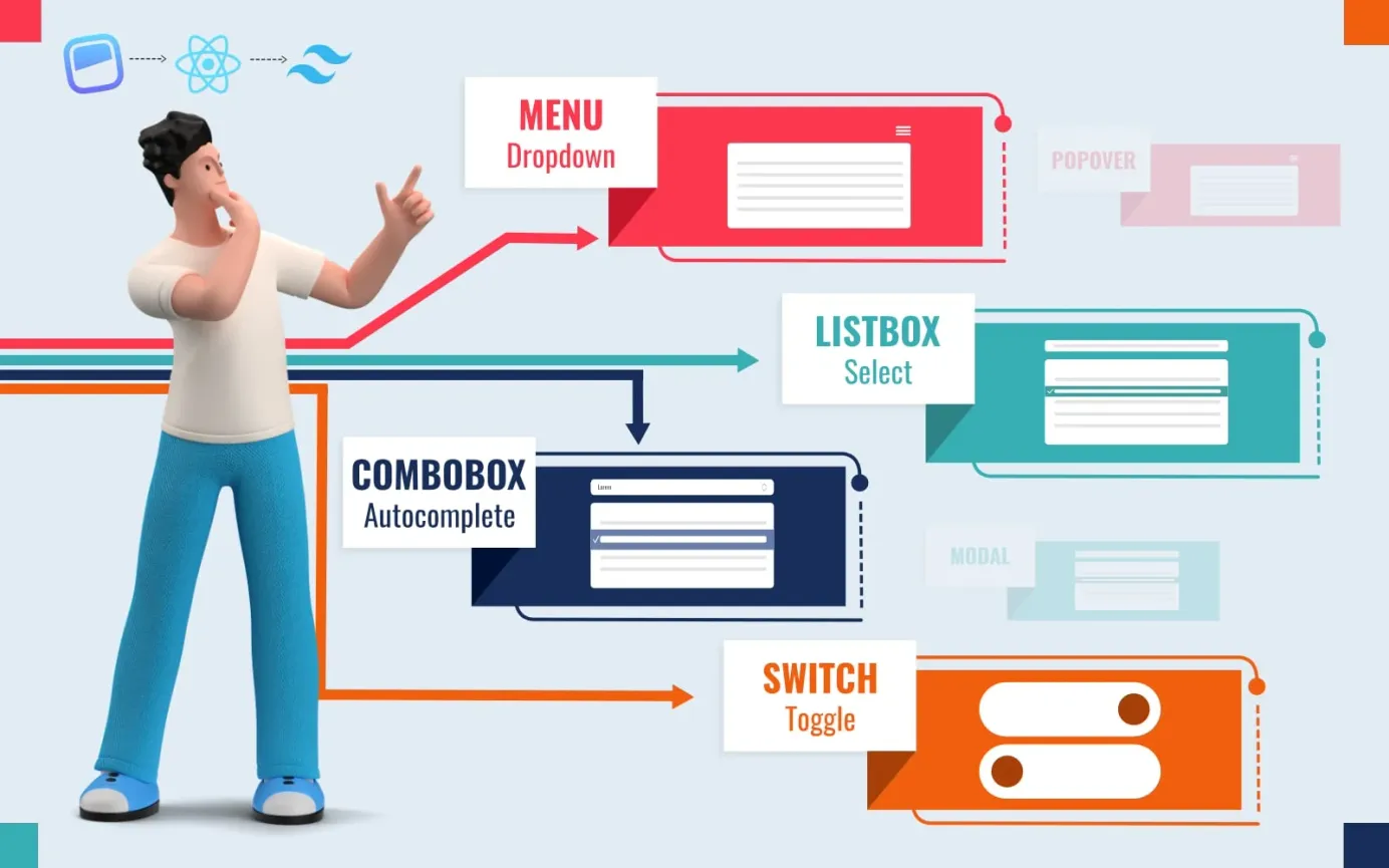
The Semantic UI React component library includes both common and novel-but-useful components. Examples of more novel components include advertisements with Google Adsense, styled accordions, tabs with pointers, slide out sidebars, statistics groups and comment sections. As you can see from the examples below, the available components are time savers that enable any developer to build a professional user interface.


Technical Benefits of Semantic UI React
There is a lot to like about Semantic UI React:
- No jQuery
Unlike the original framework, Semantic UI React does not require jQuery to be loaded. Instead, all the necessary jQuery functionality has been implemented in React. - Semantic UI React uses a declarative API
Declarative APIs allow developers to specify their desired outcome, as opposed to having to detail all the steps involved in achieving that outcome. This usually means less code is required to achieve a given result, so the coding process is faster and more efficient. - Augmentation support
Augmentation means you can enhance the functionality of the Semantic UI React components. Typically, this is done by building a new object based on an existing prototype, with additional methods, props and customizations defined only for the new object. Augmenting components allows you to add props and features to existing components without creating additional nested ones. This is invaluable when dealing with MenuLinks and react-router. - Shorthand props will save you time
Shorthand props are short and simple ways of defining what you want to display, without having to write out all the HTML. This is a big time saver - all the fiddly stuff is taken care of for you. - Sub-components put you in control
With Semantic UI React, you can customize components easily because you have access to the full mark-up when creating sub-components. You can therefore tweak it however you wish. - Automatic state control
The stateful components in Semantic UI React work straight out of the box. You don't need to add any wiring to manage their states. For example, simply click on a dropdown and it will open automatically, with the value stored internally - no need for any additional code. You can override this default behavior if you prefer though - you can mix and match whatever number of controlled or uncontrolled props you want; adding or removing control when desired is as simple as adjusting your props.
Installation of Semantic UI React
Install via npm or yarn
To install Semantic UI React via npm or yarn, you will first need to install React and Node.js on your system. Once you have those installed, you can use the steps below to install Semantic UI React.
First, open a terminal or command prompt and navigate to the directory where you want to install Semantic UI React. Then, run the following command to install Semantic UI React and its dependencies:
npm install semantic-ui-react semantic-ui-css Or you can use yarn:
yarn add semantic-ui-react semantic-ui-cssOnce the installation is complete, import the minified CSS file into your React app. For example:
import 'semantic-ui-css/semantic.min.css'
You will also need to include the Semantic UI CSS styles in your app. To do this, you can either use the semantic-ui-css package, or include the stylesheets directly in your HTML.
Use the CDN
Rather than installing Semantic UI React via npm or yarn, an alternative is to simply call in the Semantic UI React CDN version within your HTML body after initializing React:
<body>
  <!-- ... other HTML ... -->
  <!-- ... Load React ... -->

  <link
    async
    rel="stylesheet"
    href="https://cdn.jsdelivr.net/npm/semantic-ui@2
/dist/semantic.min.css"
  />
  <script src="https://cdn.jsdelivr.net/npm/semantic-ui-react
/dist/umd/semantic-ui-react.min.js"></script>

  <!-- Load your React component. -->
  <script src="myComponent.js"></script>
</body>
Once you have imported the components and included the styles, you can use them in your React app just like any other React component. For example:
<Button>Click me!</Button>
Although using the CDN version of Semantic UI React is the fastest way to get started, it is not recommended for production environments.
Semantic UI React Examples
Semantic UI React Example 1: Simple Button
In this example, a simple list is created with a standard button. To see the code in action, slide the vertical handle on the right across to the left.
You can achieve the same result using shorthand, as shown in the code sandbox below:
Semantic UI React Example 2: Card
The code in the sandbox below creates a simple card with image. To see the code in action, slide the vertical handle on the right across to the left.
You can achieve the same thing with props:
Further Info
For further details please refer to the Semantic UI React documentation.


