Material UI React Components: Impress Your Users

Material UI React components allow developers to build classy user interfaces rapidly. Aesthetically impressive. Get to market fast.
Material UI, or "MUI", is a popular React component library that allows developers to build classy user interfaces rapidly. If you want an aesthetically impressive interface and fast speed-to-market then Material UI should be on your shortlist.
Material UI is based on Google's Material Design system. Material Design was inspired from items in the physical world, particularly paper and ink, and is comprised of beautiful and functional design elements that feel comfortable and intuitive for a wide range of users.
The Material UI React components are therefore interactive building blocks which you can pull together quickly to construct a beautiful and intuitive interface for your React.js applications.
Key features of Material UI
Some of the key features of Material UI are:
- An extensive selection of pre-configured, customizable React components.
- Faster time-to-market due to making use of prebuilt React components.
- Effortless theming that allows you to quickly change the look and feel of your application to match your brand.
- An active support community with a large number of third-party components and templates available.
- Advanced components via the MUI X library for complex use cases such as data grids, date range pickers, charts, tree views and more.
- Support for internationalization and a high priority placed on accessibility.
- Thorough documentation with a comprehensive library of components with visual and code examples available on the Material UI website.
How to install Material UI for React
Installing Material UI is as simple as utilizing npm, the package manager that comes with Node.js. To get started, verify you have both Node.js and npm installed on your system with the following commands, which should return the version number of each:
node -v
npm -v
Once you have confirmed that npm and Node.js are installed, change to the folder containing the project for which you are planning to use Material UI, then run the following command to install it:
npm install @mui/material @emotion/react @emotion/styledAlternatively, you can use the yarn package manager to quickly install Material UI by changing into your project directory and typing:
yarn add @mui/material @emotion/react @emotion/styled
For more information on Emotion CSS, please review the article below:
 Staff Writer
Material UI example
By utilizing the Material-UI component library in your React application, you can create an enhanced user interface with a remarkable look and feel. Here's an example of how it works:
import React from 'react';
import { Button } from '@material-ui/core';

function MyButton() {
  return (
    <Button variant="contained" color="primary">
      Click me!
    </Button>
  );
}
In the example above, a Material-UI button is created by importing the Button component from @material-ui/core then using it as the basis for a new component called MyButton. The Button component comes with props like variant and color that enable the developer to modify the component's appearance and behavior.
Material UI demos
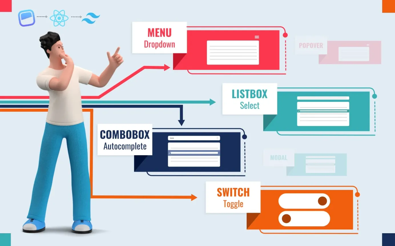
The easiest way to see exactly what can be done with MUI is to visit the MUI website and to browse to the Components listing in the left-hand menu. Explore the individual component pages to see the components in action alongside code examples. For example:
and much, much more.
Further info
For further information please refer to the vendor's website and documentation at https://mui.com.


